By Kashida Fashion Institute
In fashion, color is more than visual — it’s psychological and strategic. Designers who master color don’t just create beautiful clothes; they create emotions, influence perceptions, and even guide consumer behavior.
Here’s a practical guide to how color works in fashion, so you can start using it with intention.
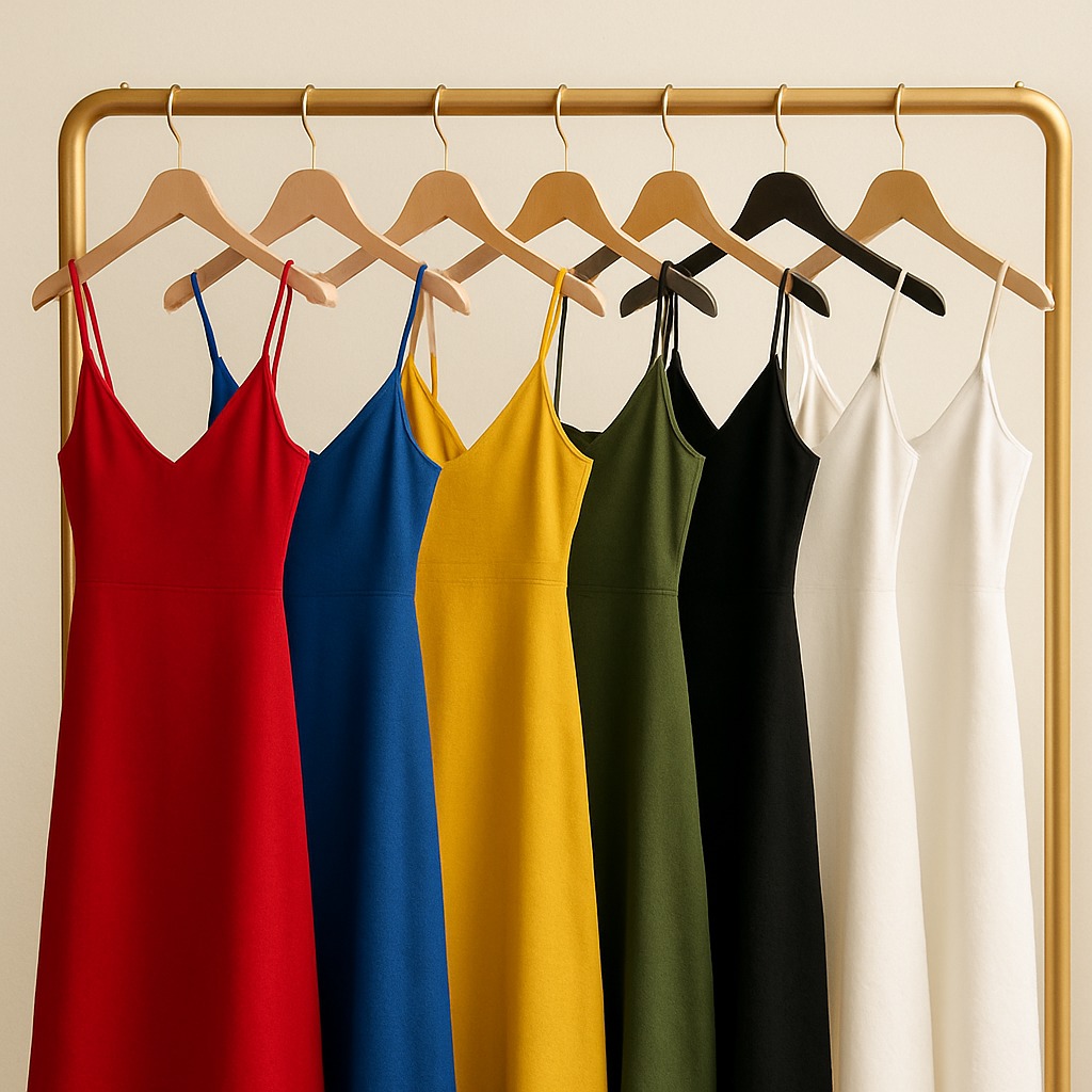
🔴 Red — Assertive. Passionate. Commanding.
Used for: Eveningwear, campaigns, fashion statements
– Red attracts immediate attention.
– It triggers emotion — love, power, urgency.
– In retail, it’s used to signal boldness or urgency (e.g., sale signs).
Use when you want to lead the room or grab focus.
🔵 Blue — Reliable. Professional. Calm.
Used for: Workwear, denim, uniforms
– Blue creates trust. It’s associated with loyalty and competence.
– Lighter blues feel fresh; darker tones feel strong and refined.
– Top brands use navy to signal stability (think luxury airlines or finance brands).
Use when you want to appear composed, focused, and credible.
🟡 Yellow — Creative. Warm. Optimistic.
Used for: Streetwear, Gen Z fashion, playful edits
– Yellow sparks curiosity and energy.
– In fashion, it’s risky — the wrong shade can overpower.
– Balanced yellows (mustard, ochre) feel more mature and wearable.
Use when you want to express joy, spontaneity, or a design-led personality.
🟢 Green — Balanced. Ethical. Grounded.
Used for: Sustainable collections, casuals, nature-themed branding
– Green evokes growth, stability, and health.
– Earth tones (sage, olive) are trending in slow fashion.
– Dark greens = trust and heritage; light greens = freshness.
Use when you want to communicate eco-conscious values or calmness.
⚫ Black — Minimal. Powerful. Timeless.
Used for: High fashion, luxury, basics
– Black isn’t just “safe” — it’s strategic.
– It makes other colors pop, conceals flaws, and adds mystery.
– Designers use it to ground their collections or build brand authority.
Use when you want to be taken seriously — without saying a word.
⚪ White — Clean. Honest. Elevated.
Used for: Bridalwear, resortwear, high-end editorial
– White conveys space, refinement, and purity.
– It absorbs cultural meaning — from minimalism to ritual.
– It pairs with any palette, making it powerful in design contrast.
Use when you want to express clarity, peace, or starting anew.
🎓 What We Teach at Kashida
At Kashida Fashion Institute, color psychology is not an add-on — it’s part of our design DNA. Our students learn:
– How to select palettes based on user emotion
– How to build moodboards that speak stories
– How color guides visual merchandising and brand identity
✨ Final Thought
Every color has a job. The best designers don’t choose it based on trend — they choose it based on intention.
Next time you sketch or shop, don’t ask “What looks good?”
Ask: “What does this color want to say?”